Customizing IOSACal plots#
For this howto we will use the radiocarbon date of a sample from Riparo Bombrini, a Paleolithic site at the border between Italy and France, with transition from Neandertal to AMH.
from iosacal import R
%matplotlib inline
We import directly the single_plot function.
from iosacal.plot import single_plot as single_plot
radiocarbon_determination = R(40340, 390, "OXA-19862")
calibrated_age = radiocarbon_determination.calibrate("intcal20")
p = single_plot(calibrated_age)
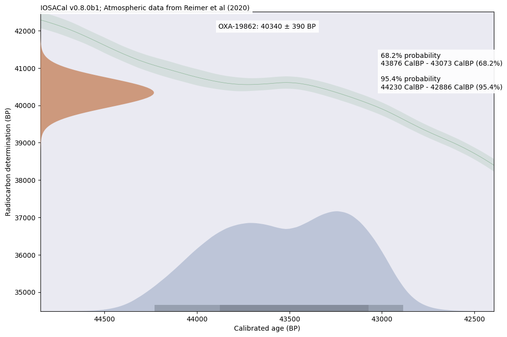
Customizing fonts#
If the default font is not of your liking, you can replace it with another font that is installed on your current system. Be careful because there is a high chance that the same fonts will not be available on other systems. DejaVu Sans is the default fallback font and it is always available.
import matplotlib.pyplot as plt
plt.rcParams["font.sans-serif"] = ["Calibri", "DejaVu Sans"]
Please note that this setting is global and it affects the entire session.
p = single_plot(calibrated_age)
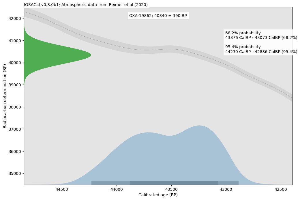
Customizing the plot with a color palette#
If the default colors don’t look good, you can create a custom palette and use it when calling the single_plot function. The custom palette is a simple Python dict with the following keys:
custom_palette = {
    "background": "#eaeaf2",
    "title_bg": "white",
    "citation_bg": "white",
    "legend_bg": "white",
    "calibrated_age": "#57729f",
    "radiocarbon_age": "#c68560",
    "calibration_curve": "#5e9c6c",
    "confidence_intervals": "tab:gray",
}
p = single_plot(calibrated_age, colors=custom_palette)
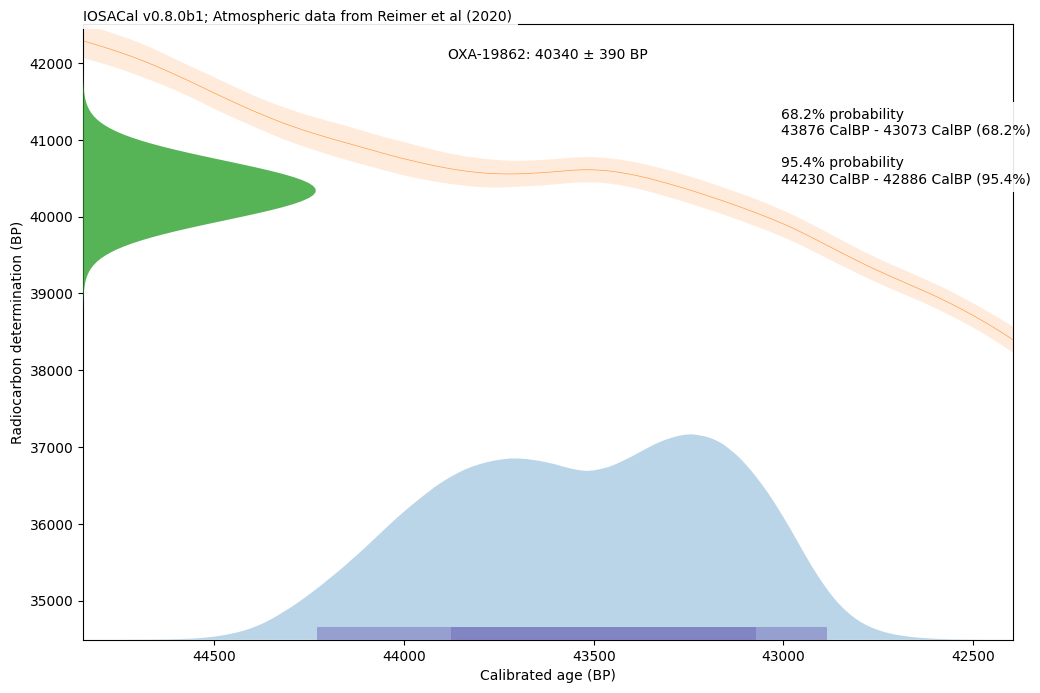
Customizing specific elements of the plot#
It’s easier to provide a custom palette before the plot is created, however the single_plot function will return the resulting Figure object. This is the standard Matplotlib object, in IOSACal one figure contains three Axes objects, each with different parts of the plot. The following walkthrough is just slightly easier than looking directly at the source code of plot.py.
Axes #0 is the first part of the plot that is drawn and it contains the background and the calibration curve. The main background is light grey by default, if you prefer it white:
p.axes[0].set_facecolor('white')
The calibration curve is actually made of two parts, the center line and the confidence intervals. They can use the same color because there is a different transparency level, with the confidence intervals in a lighter shade:
p.axes[0].lines[0].set_color('tab:orange') # calibration curve center line
p.axes[0].collections[0].set_facecolor('tab:orange') # confidence interval of the calibration curve
Axes #1 contains the calibrated age and the related confidence intervals at 68.2% and 95.4%:
p.axes[1].collections[0].set_facecolor('tab:blue') # calibrated age
for i in p.axes[0].patches:
    i.set_facecolor('tab:purple')# confidence intervals (separate patches)
Finally, Axes #2 contains the Gaussian curve representing the radiocarbon determination:
p.axes[2].patches[0].set_facecolor('tab:green') # radiocarbon age gaussian curve
When all the changes are applied, you can call again the plot with the variable name you gave it before:
p